The Best Four Colors to Have in Your Travel Instagram
The Best Four Colors to Have in Your Travel Instagram
Having these colors in travel photos can draw the most engagement — here’s why.
Talia Avakian is a lifestyle reporter based in Los Angeles with a love for outdoor excursions, off-the-beaten-path local finds, remote and historic hotels, and innovations in food. She was previously the digital news reporter for Travel + Leisure.
:max_bytes(150000):strip_icc()/colors-of-travel-study-COLORS0619-113354b40d29487fb5254f8382b609f3.jpg)
Certain colors have the ability to draw viewers in, particularly when it comes to travel photography.
To identify which of these colors are drawing the most interest, the Pantone Color Institute, influencer marketing platform Fohr, and Visit Carlsbad, teamed up to analyze the most engaged photos from 75 different influencers who had a following of 50,000 or greater, finding the four most common colors as part of their 2019 Colors of Travel Study.
The hues have been named according to the images they draw reference to and the emotions they evoke, with Visit Carlsbad creating a range of activities where visitors to the California beach stop can experience the shades.
They are: Rose Dawn (described as a soft and dusty pink), Ethereal Blue (an expansive blue hue often seen in open skies), Ocean Depths (a calming shade resembling the color of the sea and deep lagoons), and Harvest Gold (a warm yellow reminiscent of fall flowers and sunsets).
:max_bytes(150000):strip_icc()/colors-of-travel-study-colors-COLORS0619-4b3f5da605ae41c790d58c7e98b59283.jpg)
Rose Dawn was given its name thanks to its association with the dawn and early morning sunrise, when a comforting sense of peace and quiet can be felt. The color, which is also found in florals, is associated with natural elements and a natural healthy glow, tying in thoughts of wellness, according to Laurie Pressman, Vice President of Pantone Color Institute.
:max_bytes(150000):strip_icc()/red-algae-spa-treament-COLORS0619-d15d5059520f4917990087346d89fd06.jpg)
Ocean Depths is a teal color that fuses green and blue, showcasing hues often found in the ocean, on coastal shorelines, and in deep lagoons. The color combines attributes from both blue and green, including the feelings of calm often associated with blue and the feelings of soothing and healing attributed to green.
Ethereal Blue is reminiscent of clear blue skies, giving the feeling of endless opportunities to get outside and explore nature. The color is one we often see daily, which is why Pressman says the color also produces a sense of calm and tranquility when viewed.
:max_bytes(150000):strip_icc()/ethereal-blue-coastline-COLORS0619-679535825cd640b7a22603e4f01317e4.jpg)
The open skies and blue oceans paint scenes of Ethereal Blue in Carlsbad, California. Courtesy of Visit Carlsbad
Meanwhile, Harvest Gold is a shade often seen when fall arrives and golden leaves and florals abound. The color also draws reference to sandy beaches and images of spices used to create culinary delights.
“Color has always been a part of why we travel; the desire to ‘see’ a new place is rooted in a mental image we’ve already conjured.” Grace Murray, Vice President at Fohr, said in a statement. “We are drawn to land and cityscapes that look drastically different to our own.”
In celebration of the findings, Visit Carlsbad has created an interactive map showcasing new culinary offerings, wellness treatments, and outdoor experiences offering the new Colors of Carlsbad palette.
:max_bytes(150000):strip_icc()/chandlers-grapefruit-paloma-COLORS0619-9c82d24aac6f484aa518c2f4d3ca3262.jpg)
These include everything from spa treatments like a red algae body scrub at Ocean Crest Spa and a facial incorporating Patagonian seaweed at The Spa at Omni La Costa, to culinary offerings like golden scallops at Jeane et Jolie and cocktails and beer offerings in pink, blue, and yellow tones at locations like Jeane et Jolie, Chandler’s, Ocean Pool Bar and Grill at Park Hyatt Aviara Resort and Spa, Barrel Republic, and Park 101.
Visitors can also see these colors in the flower fields and lagoons found in Carlsbad, in addition to the beaches where water activities like jet skiing and kayaking await.
The Color of Travel. Emotions in Red, Blue, White, Green and Yellow
The color of travel… I got to think of it thanks to the Capture the Color photography competition. A nice contest and not only for the great prizes that Travel Supermarket – the organizers of the competition – are offering to the winners (iPad to the winners for each color class and GBP 2,000 – oh yes! – to the overall winner). Colors often symbolize a country, sometimes a mood and I often associate colors to special emotions during my travels. Thank you to Abigail King (and to Juno, of Runaway Juno) for inviting me to take part!
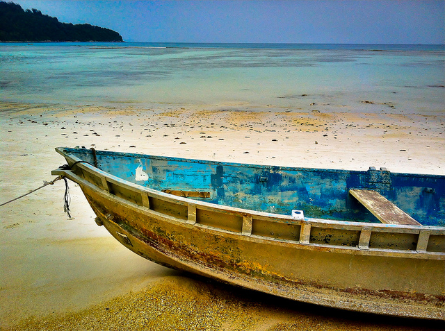
I was walking along the seashore in Pulau Perhentian (Malaysia) when I stepped into this old boat lying on the beach. I was struck by the contrast between the bright blue coloring the inside, the white sand and again, in the background, the different shades of blue of the sea.
Blue is the color of travel to Greece – where it complements white – and it reminds me of the unique blue skies at the Titicaca Lake, in Peru.
White
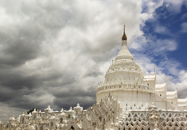
In the land of gold – Burma – I was fascinated by the white Hsinbyume Pagoda in Mingun (not far from Mandalay), maybe because it was a change from the glittering golden stupas that are spotting the country.
When I think at the color white, I can’t help seeing the glaciers and their awesome shapes.
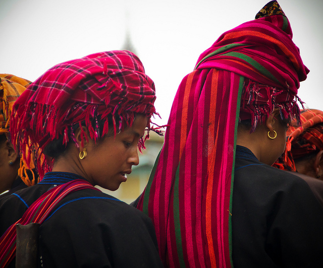
One of the highlights when visiting the markets at Inle Lake (Burma) is spotting the Pa-O women with their traditional head dressings made of colorful clothes (usually bright orange or red), arranged in a beautiful fashion. Overall, Burmese don’t use many bright colors, and even the monks robes are of a deep dark red which I find more austere than brilliant.
Red… The color which I most associate with Central and Latin America. After all… Red is the color of passion!
Green
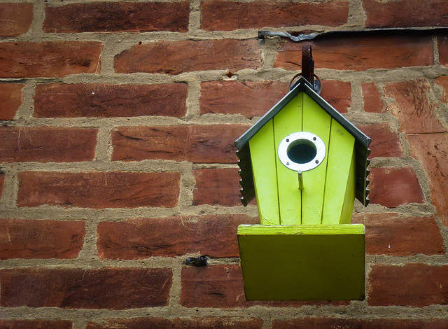
I spotted this bright green bird house in Canterbury, one of the loveliest cities of Southern England. As I admired the lovely contrast between the peculiar shade of green of the bird house and the red bricks wall, I wondered if it was only meant to decorate the façade or if a bird was living there.
Green… I think of Great Britain and the many shades of green which I rarely spotted in other countries. And I remember the lovely walk on the green meadows atop the white cliffs of Eastbourne.
Yellow
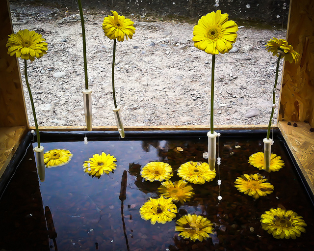
Yellow gave me a hard time as I can’t really imagine it as a color of travel. It’s not one of my favorite colors and there’s not much of it in my pictures. Sometimes, however, yellow captures my attention, as in this flower composition at Girona Temps de Flors (the beautiful annual flower festival in what is one of the loveliest cities in Costa Brava). Simple and common yellow Gerberas arranged in a creative way to compose an original natural sculpture.
Which one is your favorite Color of Travel?
I am now in the hands of the judges: Ken Kaminesky (Blue), Abigail King (Green), The Planet D (Yellow), Almost Fearless (White) and Daniel from Canvas of Light (Red), hoping they’ll like the shots (selecting the best ones was not an easy task…).
As for the nominations, I’m afraid that most bloggers have already been invited but I’ll give it a try:
And if you fancy Entering the Capture the Color Competition…
Simply post your best travel photos on your blog in any or all the five color categories (green, blue, red, white and yellow) link to the competition details and nominate five other bloggers. You then need to let Travel Supermarket know you’ve entered, which you can do by either Facebook, Twitter or email. Here are the full terms and conditions. The deadline is August 29th.
The Best Four Colors to Have in Your Travel Instagram
Having these colors in travel photos can draw the most engagement — here’s why.
Talia Avakian is a lifestyle reporter based in Los Angeles with a love for outdoor excursions, off-the-beaten-path local finds, remote and historic hotels, and innovations in food. She was previously the digital news reporter for Travel + Leisure.
:max_bytes(150000):strip_icc()/colors-of-travel-study-COLORS0619-113354b40d29487fb5254f8382b609f3.jpg)
Certain colors have the ability to draw viewers in, particularly when it comes to travel photography.
To identify which of these colors are drawing the most interest, the Pantone Color Institute, influencer marketing platform Fohr, and Visit Carlsbad, teamed up to analyze the most engaged photos from 75 different influencers who had a following of 50,000 or greater, finding the four most common colors as part of their 2019 Colors of Travel Study.
The hues have been named according to the images they draw reference to and the emotions they evoke, with Visit Carlsbad creating a range of activities where visitors to the California beach stop can experience the shades.
They are: Rose Dawn (described as a soft and dusty pink), Ethereal Blue (an expansive blue hue often seen in open skies), Ocean Depths (a calming shade resembling the color of the sea and deep lagoons), and Harvest Gold (a warm yellow reminiscent of fall flowers and sunsets).
:max_bytes(150000):strip_icc()/colors-of-travel-study-colors-COLORS0619-4b3f5da605ae41c790d58c7e98b59283.jpg)
Rose Dawn was given its name thanks to its association with the dawn and early morning sunrise, when a comforting sense of peace and quiet can be felt. The color, which is also found in florals, is associated with natural elements and a natural healthy glow, tying in thoughts of wellness, according to Laurie Pressman, Vice President of Pantone Color Institute.
:max_bytes(150000):strip_icc()/red-algae-spa-treament-COLORS0619-d15d5059520f4917990087346d89fd06.jpg)
Ocean Depths is a teal color that fuses green and blue, showcasing hues often found in the ocean, on coastal shorelines, and in deep lagoons. The color combines attributes from both blue and green, including the feelings of calm often associated with blue and the feelings of soothing and healing attributed to green.
Ethereal Blue is reminiscent of clear blue skies, giving the feeling of endless opportunities to get outside and explore nature. The color is one we often see daily, which is why Pressman says the color also produces a sense of calm and tranquility when viewed.
:max_bytes(150000):strip_icc()/ethereal-blue-coastline-COLORS0619-679535825cd640b7a22603e4f01317e4.jpg)
The open skies and blue oceans paint scenes of Ethereal Blue in Carlsbad, California. Courtesy of Visit Carlsbad
Meanwhile, Harvest Gold is a shade often seen when fall arrives and golden leaves and florals abound. The color also draws reference to sandy beaches and images of spices used to create culinary delights.
“Color has always been a part of why we travel; the desire to ‘see’ a new place is rooted in a mental image we’ve already conjured.” Grace Murray, Vice President at Fohr, said in a statement. “We are drawn to land and cityscapes that look drastically different to our own.”
In celebration of the findings, Visit Carlsbad has created an interactive map showcasing new culinary offerings, wellness treatments, and outdoor experiences offering the new Colors of Carlsbad palette.
:max_bytes(150000):strip_icc()/chandlers-grapefruit-paloma-COLORS0619-9c82d24aac6f484aa518c2f4d3ca3262.jpg)
These include everything from spa treatments like a red algae body scrub at Ocean Crest Spa and a facial incorporating Patagonian seaweed at The Spa at Omni La Costa, to culinary offerings like golden scallops at Jeane et Jolie and cocktails and beer offerings in pink, blue, and yellow tones at locations like Jeane et Jolie, Chandler’s, Ocean Pool Bar and Grill at Park Hyatt Aviara Resort and Spa, Barrel Republic, and Park 101.
Visitors can also see these colors in the flower fields and lagoons found in Carlsbad, in addition to the beaches where water activities like jet skiing and kayaking await.
Source https://www.travelandleisure.com/travel-tips/colors-of-travel-study-carlsbad#:~:text=They%20are%3A%20Rose%20Dawn%20%28described%20as%20a%20soft,and%20sunsets%29.%20Courtesy%20of%20the%20Pantone%20Color%20Institute
Source https://wild-about-travel.com/capture-color-travel-emotions/
Source https://www.travelandleisure.com/travel-tips/colors-of-travel-study-carlsbad